
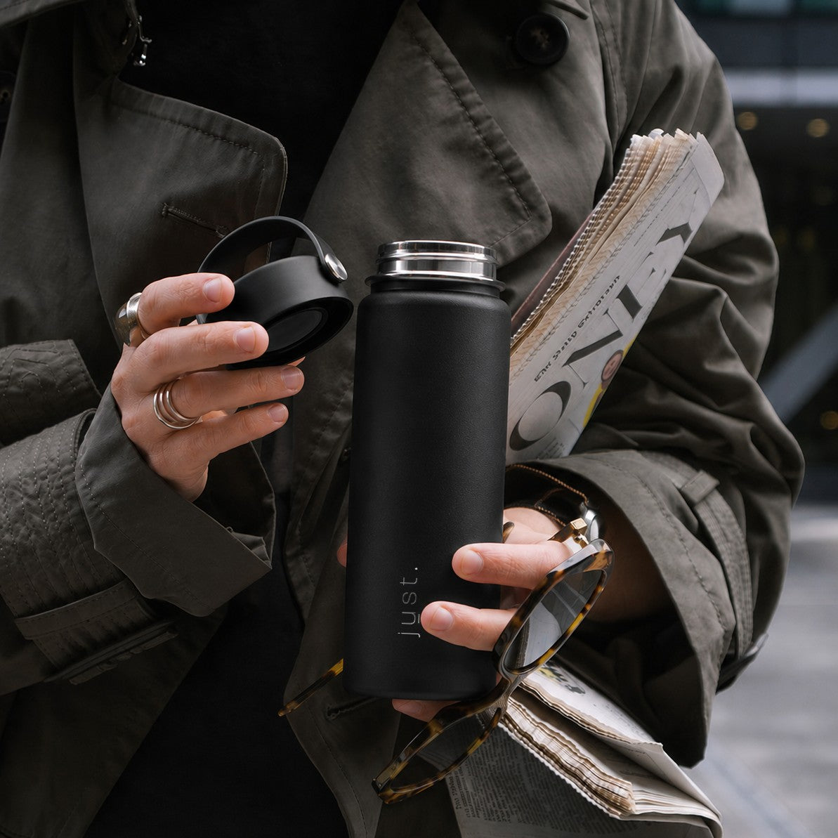

You approve the digital mock-up. It looks sharp, balanced, exactly how you imagined it. Then the shipment arrives. The logo feels slightly stretched. The colour is not quite right. The placement looks a little off. Not wrong, exactly. Just different.
If you have ever ordered water bottles with logo branding and felt that quiet mismatch between screen and reality, you are not alone. It is one of the most common frustrations in branded merchandise, and it is almost never a printing error.
The reason is simple: screens are flat and emit light. Bottles are curved and reflect it. Once you understand how a physical object behaves differently from pixels, the surprises start to disappear, and your water bottle logo design gets better before anything is printed.
Short answer: a logo looks different on a real bottle because the surface is cylindrical (edges stretch and compress), the print method changes sharpness and depth, the finish changes how light hits the colour, and RGB screen colours cannot be reproduced exactly in ink or engraving. The fix is to design for curvature, choose the print method to suit the logo, check contrast against the bottle colour, and approve a physical sample before the full run.
Screens are flat. Bottles are not.
A digital mock-up shows your logo on a perfectly straight, evenly lit surface. Most bottles are cylinders. When a logo wraps around a rounded surface it subtly stretches at the edges, straight lines appear to curve, and fine details compress or distort. What felt perfectly proportioned on a rectangular screen feels different in the hand.
Tall, narrow logos exaggerate this. Thin lines look lighter at the edges. Even spacing can feel uneven once the design wraps around a cylinder. Your eye notices immediately because it is comparing the object with the flat version you approved.
This is not a fault. It is geometry. Designing for bottles means designing for curvature from the start, which usually means keeping the logo width to no more than about a third of the bottle's circumference so the whole mark is visible from a single viewing angle.
How much of the bottle can a logo actually use?
The numbers below are typical for the bottle shapes we print and engrave most. Treat them as a starting point rather than a rule; your supplier should confirm the exact print area for the bottle you choose.
| Bottle type | Body diameter | Usable print width (approx.) | Usable print height (approx.) | Watch out for |
|---|---|---|---|---|
| Slim stainless steel (500 ml) | 65 to 70 mm | 60 to 70 mm | 100 to 140 mm | Wide logos wrap out of view |
| Standard stainless steel (750 ml to 1 L) | 75 to 85 mm | 70 to 85 mm | 140 to 180 mm | Centre-of-gravity grip zone covers lower third |
| rPET sports bottle (500 to 750 ml) | 65 to 75 mm | 60 to 70 mm | 90 to 120 mm | Ribbed or textured grip panels interrupt print |
| Insulated tumbler (tapered) | 75 to 90 mm, tapering | 60 to 75 mm | 80 to 110 mm | Taper distorts straight horizontal lines |
If your logo is wider than it is tall, it will need to shrink to fit the usable width, which can make small type unreadable. A stacked version of the logo often works better on a bottle than the horizontal lock-up used on your website.
Why print methods change how logos appear
On-screen previews do not show how different decoration methods affect sharpness, texture or depth. The main methods used on branded bottles behave quite differently.
Screen printing
Bold and vibrant. Works well for strong, solid colours and larger marks. Fine lines can soften slightly depending on ink thickness, and each colour is a separate pass, so multi-colour logos cost more and need tight registration.
Laser engraving
Subtle, permanent and premium. Rather than adding colour, the laser removes the top layer of coating to reveal the stainless steel beneath. The result is refined and always a single tone, so it reads more muted than a colour preview. Engraving only works on stainless steel; plastic and rPET bottles are printed, not engraved.
Pad printing
Precise for smaller areas and awkward curves. Good edge definition, but colour density depends on the material underneath, so a white logo on dark powder coat may need two hits to look solid.
Full-wrap digital or UV printing
Allows photographic detail and gradients around the whole bottle. Excellent for seasonal or limited-edition designs, but the design must be built on a cylindrical template or the seam and distortion will be visible.
| Method | Best for | Colours | Fine detail | Durability | Materials |
|---|---|---|---|---|---|
| Screen print | Bold solid logos | 1 to 4 spot colours | Medium | High | Steel, rPET, glass |
| Laser engraving | Premium, understated branding | Single tone (steel) | High | Permanent | Stainless steel only |
| Pad print | Small marks, lids, curved spots | 1 to 2 spot colours | High | Medium to high | Steel, plastic |
| Full-wrap digital/UV | Gradients, photos, patterns | Full colour | High | Medium to high | Steel, rPET |
At Just Bottle we handle colour printing and precision laser engraving in-house, which lets us adjust placement, sizing and finish based on real-world testing rather than only mock-ups.
Finishes matter more than most teams expect
Light behaves differently on matte, gloss and powder-coated surfaces, and that changes how your logo reads.
- Matte diffuses light, softens reflections and slightly mutes colour. Logos look calm and even, but low-contrast marks can disappear.
- Gloss reflects light sharply. Colours look brighter, but any small alignment shift is more visible, and glare can hide part of the logo in photos.
- Powder coat adds a fine texture and depth that slightly lowers perceived contrast, especially with dark-on-dark combinations.
- Brushed or bare steel gives engraving its best contrast, because the laser exposes bright metal against a darker or coloured surface.
Black-on-black branding looks sleek in a digital preview, but in real life it can be hard to read under office lighting. Tone-on-tone logos often look understated, sometimes too understated. Premium finishes can backfire if contrast is not considered carefully.
Colour on screen is not colour on material
RGB values do not exist in the physical world. A screen emits light; a bottle reflects it. That is why your brand blue can look slightly different on a stainless steel bottle, an rPET bottle and a powder-coated tumbler, even from the same ink.
Some colours are more sensitive than others:
- White picks up warmth or coolness from the base colour and may need a double hit on dark bottles.
- Neons and brights glow on screen because the screen is lit from behind. Printed, they sit flatter.
- Pastels shift noticeably with the finish, looking chalky on matte and washed out on gloss.
- Metallic inks depend on the angle of light and never match a flat metallic swatch on screen.
This is why suppliers ask for Pantone references rather than hex codes, and why a physical sample is worth the extra few days. Pantone gives the printer a defined ink target. A hex code gives them a guess.
Why curved surfaces expose alignment issues
A logo can be perfectly centred in a digital file and still feel slightly off once printed, because bottles are not viewed head-on. People hold them at angles, hands wrap around the grip zone, and the eye sees only part of the surface at once.
Experienced manufacturers think about viewing angles: how the bottle looks sitting on a desk, held in a hand, or photographed at an event. A logo placed in the upper third of the body is visible above the hand in most grips, which is why it is the default position for most branded bottles. Lower placements look good on a shelf and disappear in use.
How to design a logo that survives the bottle
Some logos translate to cylinders better than others. If you are preparing a water bottle logo design, these principles will save a reprint:
- Favour simple marks over intricate detail. Minimal logos are easier for the eye to process on a curved, moving object.
- Remove ultra-thin lines. Anything under roughly 0.3 mm can break up in screen print or fill in during engraving.
- Limit gradients unless you are using full-wrap digital print. Spot-colour methods cannot reproduce them.
- Prioritise contrast against the actual bottle colour, not against a white artboard.
- Use the stacked version of your logo for narrow bottles, and keep the width under a third of the circumference.
- Set a minimum type size. Small text below about 6 pt is unreadable on a bottle regardless of method.
- Supply vector files. SVG, PDF, AI or EPS keep edges crisp at any size. A high-resolution PNG is acceptable; a JPEG screenshot is not.
Step by step: from mock-up to approved bottle
- Choose the bottle first, then the logo version. Shape and material decide the print method, usable area and finish before any artwork is placed.
- Send vector artwork and Pantone references. Include your brand guidelines if you have minimum-size or clear-space rules.
- Review the digital proof for position and proportion only. Treat colour on screen as indicative, not final.
- Request a physical sample for anything over a small order or where colour accuracy matters. Photograph it in the setting it will be used in, not only on a white desk.
- Adjust once, then approve. Most corrections are small: a slightly bolder line weight, a darker base colour, moving the logo 10 mm higher.
- Run production. Keep the approved sample as the reference for any repeat orders so brand consistency holds across years, not just one batch. Our guide to ordering custom water bottles in bulk covers how to keep repeat runs consistent.
What a good manufacturer does for you
Good manufacturers act as translators between the digital design and the physical object. They should recommend the most suitable print method for your logo, adjust proportions to allow for curvature, suggest stronger contrast for specific finishes, offer engraving versus colour print guidance, and provide a physical sample before full production. If a supplier skips straight from mock-up to production without any of that conversation, expect surprises when the boxes arrive. Our article on why corporate water bottles fail internally explains how a bottle that looks slightly wrong ends up in a drawer rather than on a desk.
For a broader look at the choices involved, see how to custom design water bottles, and if you only need a small test run first, printed water bottles with no minimum order explains what is realistic.
Bottles are objects, not screens
When a company invests in branded bottles it is choosing something tactile, visible and long-lasting. Unlike a digital ad, a bottle exists in three dimensions. It reflects light, gets handled, dropped, photographed and reused every day. That physicality is the whole point, but it requires a shift in mindset: the goal is not to replicate the screen perfectly. It is to create a logo that works beautifully in the real world.
At Just Bottle, every 100 bottles ordered funds the collection of 10 kg of ocean-bound plastic through Plastic Bank, roughly 500 plastic bottles kept out of the sea. That impact sits beneath the surface of every bottle we produce, quite literally: our sustainability information is kept discreetly on the underside so your logo keeps centre stage.
Frequently asked questions
Why does my logo look stretched on a water bottle?
Because the bottle is a cylinder. As the logo wraps around the curve, the edges move away from the viewer and appear to compress while the centre looks wider. Keeping the logo under about a third of the circumference and using a stacked rather than wide lock-up reduces the effect.
What is the best print method for a logo on a water bottle?
Screen printing for bold, solid-colour logos on steel or rPET; laser engraving for a premium single-tone finish on stainless steel; pad printing for small marks or lids; full-wrap digital print for gradients and patterns. The right choice depends on the logo's detail, colour count and the bottle material.
Can you laser engrave a plastic or rPET bottle?
No. Laser engraving works by removing the coating on stainless steel to reveal the metal. Plastic and rPET bottles are printed instead, usually by screen or pad printing.
What file format should I send for a water bottle logo?
Vector files (SVG, PDF, AI or EPS) are best because they stay sharp at any size. A high-resolution transparent PNG is acceptable for simple logos. Avoid JPEGs and screenshots, which blur at the edges when scaled.
Why does the colour on my bottle not match my screen?
Screens emit light in RGB, while ink and coatings reflect it. Material, finish and base colour all shift how a colour reads. Supplying Pantone references and approving a physical sample is the only reliable way to control the result.
Do I need a physical sample before ordering water bottles with a logo?
For small, single-colour orders on a standard bottle, a digital proof is usually enough. For large runs, multi-colour logos, pale or neon colours, or anything where brand accuracy matters, a physical sample costs a few days and saves a reprint.
Ready to see your design the way it is meant to look?
Explore our range of branded water bottles, from stainless steel Clipper and Pioneer bottles to rPET and insulated tumblers, and request a physical sample before full production. We will help your brand move from pixels to something people actually hold, carry and use.