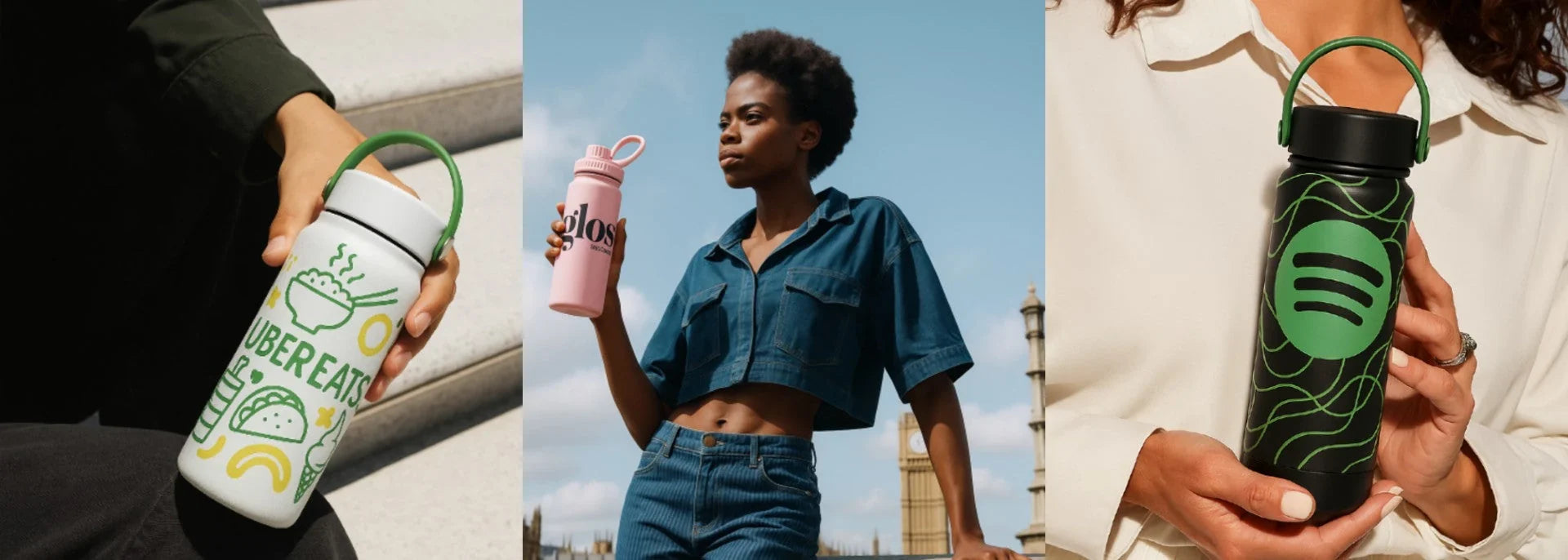

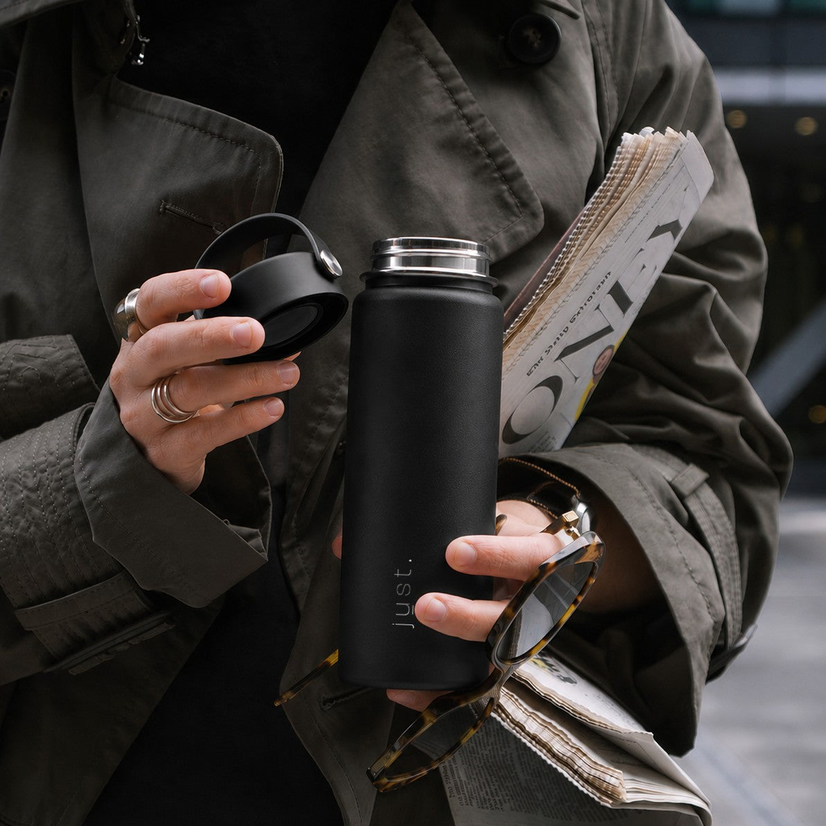

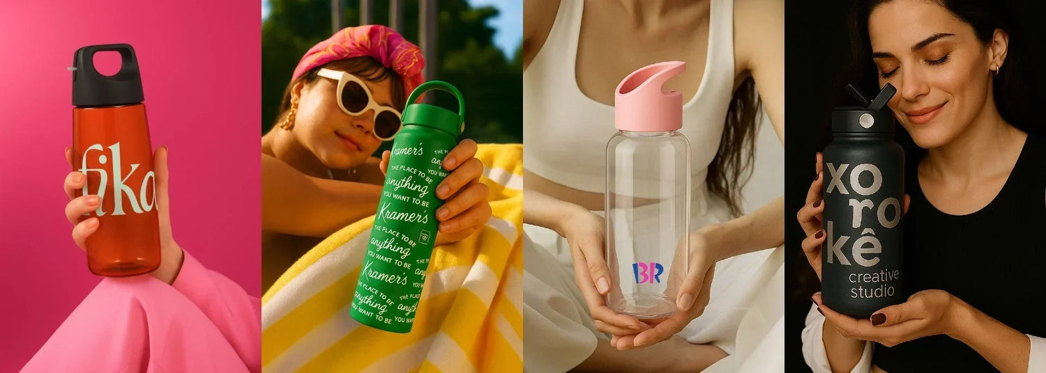
The power of hue in every gift
Corporate gifts aren’t just things you hand out at the end of a meeting or mail with a thank-you card. They’re small but powerful touchpoints that tell people who you are as a brand — what you stand for, the care you put into details, even the kind of experience you want them to have with you.
Colour plays a huge role in that story. It’s the first thing people notice and the part they remember long after the packaging is gone. The right shade can make a reusable bottle feel like a piece of someone’s everyday kit, something they’re proud to carry. The wrong one can make it look like an afterthought that never leaves the cupboard.
In this guide we’ll explore how colour shapes perception and behaviour, how to choose a palette that fits your brand and audience, and why finishes and materials matter as much as the colour itself. Along the way, we’ll show how Just Bottle’s carefully curated colours and premium stainless steel finishes help turn a simple gift into something that genuinely connects.
Why colour matters in corporate gifts
Colour does more than decorate — it instantly sets a mood and tells a story. Research shows that the wise use of colours helps a brand distinguish itself and influence how people perceive its personality. Colour creates mood, signals identity, and primes expectations even before form or text is processed.
In marketing, studies suggest that up to 90% of snap judgments about products can be based on colour alone. Some brand recognition studies even claim using consistent colour palettes can boost recognition by up to 80%.
Translating this into gifting: your colour choices send immediate, subconscious signals.
- A deep navy may evoke trust, stability and professionalism.
- An olive green or moss tone suggests nature, growth and sustainability.
- A soft beige, sand or almond speaks minimalism and ease.
- Bright tones (mint, blush, coral) can feel fresh and modern — but require balance.
A gift’s colour should represent your brand identity, not clash with it. In many cases, colour is your most immediate, powerful visual cue in a gift.
How employees and clients respond to colour choices
It’s one thing to pick a shade you like. It’s another to pick a shade people will keep using.
When a gift “feels beautiful,” it becomes part of the daily visual vocabulary of its recipient — it lives on desks, in bags, on kitchen counters. That’s how it earns more impressions and brand resonance over time. Studies show that products with thoughtful design (including colour) tend to survive longer in homes and offices.
Conversely, a garish or clashing colour can make even a great product feel like clutter. Once it jars against the recipient’s aesthetic or feels out of place, it gets relegated to drawers or given away.
In short: colour affects longevity, use frequency, and emotional attachment. The more a gift “fits” someone’s taste and environment, the more brand value it delivers over time.
Matching colour to your brand values
Choosing colours isn’t a free-for-all. A thoughtful brand-led approach helps your gifts reinforce, not confuse, your identity. Here are practical paths to align shades with brand values and audience.
- Wellness, sustainability or nature-led brands → earth tones: olive, sage, stone, desert, sand
- Tech, fintech, or corporate sectors → neutrals and “safe” tones: navy, charcoal, matte black, slate grey
- Creative or lifestyle sectors → accents or soft pastels: mint, blush, terracotta or custom hues aligned with brand aesthetics
- Luxury or executive gifting → jewel tones, deep greens, muted metallics or rich matte black
At Just Bottle, our product palettes reflect these philosophies. Think: the Pioneer Bottle 550ml in almond or desert tones, or the Urban Bottle 750ml in slate and muted green options. These choices let clients tailor gifts that feel part of their brand ecosystem without forcing bold colour dissonance.
When in doubt: start with your core brand palette, choose a neutral or secondary shade for your baseline bottle, then reserve accent colours for limited editions or seasonal gifts.
Finishes, materials and design — colour isn’t just paint
Colour can’t stand alone. How it interacts with texture, finish and material plays a big role in perceived quality.
- Matte finishes feel modern, subtle and tactile. They diffuse reflection and reduce glare, lending a soft understated luxury.
- Glossy surfaces can be bold, but risk feeling plasticky or dated if not executed well.
- Metallic or satin sheens add a sense of premium texture — the slightest shimmer suggests care and craftsmanship.
But underlying all of this is material. Stainless steel, for example, gives colour depth, durability and weight. It feels far more premium than painted plastic. Just Bottle’s stainless steel base means colours sit with solidity, not plastic-thin surfaces.
Finally: how a surface feels in the hand matters as much as how it looks. A bottle with pleasing weight, smooth curves and a consistent finish communicates quality across all senses.
Major mistakes in colour selection
While many people recognise the power of colour, a lot of them fall into avoidable traps. Here are common missteps before you plan for your Christmas gifting.
- Over-branding: forcing the logo to dominate or clash with colour. If the colour and branding fight, the user loses.
- Blind trend following: jumping into ultra-bright neons or viral palettes without considering long-term fit or audience.
- Cheap finishes: fade, scratch, or peel finishes instantly erode perceived value.
- Neglecting cultural meaning: colour interpretations vary globally — white is pure in some cultures, mourning in others; red is luck in one region, warning in another.
- Ignoring durability of colour: pale tones may show wear quickly; high-contrast logos may lose visibility over time.
- Colour inconsistency across SKUs: slight tone shifts between batches undermine brand consistency.
Avoid these pitfalls by anchoring your palette to your brand logic, testing physical samples, and planning with longevity in mind.
Colour and emotion — Insights from research
Recent studies reinforce the importance of colour. For example, a 2025 paper on brand colours found that strategic colour usage enhances brand recognition and emotional engagement, directly influencing purchase decisions.
Behavioural studies tell us that colour associations are not fixed but context-dependent — meaning how “appropriate” a colour feels to a product chosen for a particular brand matters more than the shade in isolation.
One classic insight from psychologist Louis Cheskin (who coined “sensation transference”) reminds us that people often unconsciously transfer feelings about packaging or surface appearance to their evaluation of the product itself. In gifting, that means your colour choice isn’t just wrapping — it shapes how a recipient values the gift internally.
Just Bottle’s advantage is colour, because we're built for brands
When you’re creating branded corporate gifts, colour and customisation go hand in hand. Our bottles are designed to showcase your brand beautifully, so every gift looks and feels like it was made for you.
- Diverse palette, thoughtfully curated – From neutral sandy tones to soft mints and deep slate greens, every hue is chosen for flexibility and to complement a wide range of brand identities.
- Ready for your artwork – We make it simple to add your logo, tagline or custom graphics with precision printing or laser engraving. Whether you prefer a bold wraparound design or a subtle one-colour mark, the finish stays sharp and vibrant.
- Colour-engineered for consistency – Our shades are developed to hold colour integrity across printing methods, ensuring your brand colours and visuals stay true from the first bottle to the thousandth.
- Premium base material – Recycled 304-grade stainless steel gives each colour lasting depth and prevents fading or chipping, so your brand impression stays strong.
- Texture-aware design – Finishes like our scratch-resistant “sandstone coat” not only look modern but also provide the perfect surface for crisp, long-lasting logo application.
- Responsible sourcing and impact – Every bottle supports ocean-plastic removal and fair employment in coastal communities, adding a story of positive impact to your branded gift.
Whether you’re matching exact Pantones, adding intricate visuals, or keeping things ultra-minimalist, Just Bottle makes it easy to create corporate branded gifts that express your identity as clearly as your own marketing materials — and that people will want to carry every day.
Use colour as strategy, not afterthought
Colour shapes how people feel about a gift before they’ve even touched it. The right shade can lift a reusable bottle from a token giveaway to a piece of someone’s daily life, strengthening brand recall every time it’s used.
At Just Bottle, we help you turn that first visual impression into a lasting connection. Our carefully curated palette, durable stainless steel finishes and precise branding options let you create corporate gifts that carry your identity everywhere — from boardrooms to weekend hikes — while backing it all with measurable environmental impact.
Browse our full business gifting collection to find the colours and finishes that match your story. Thoughtful colour choices today mean your gifts keep working for your brand long after the handover.